
 Telegram
 Stack motion hover effects with Anime.js
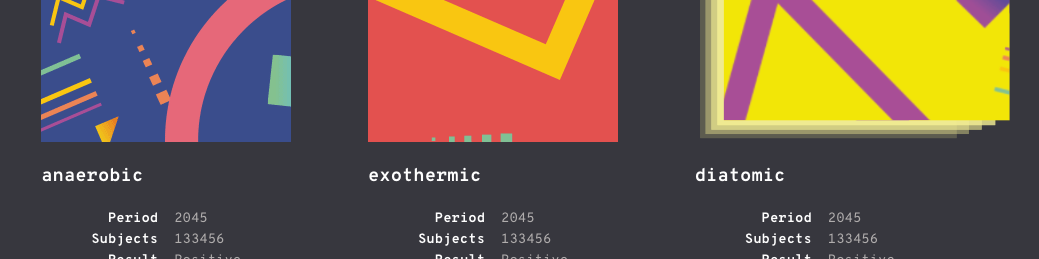
Today we would like to share a few ideas for striking hover effects. The concept builds on the effect Merci-Michel used in their portfolio. It feels genuinely pleasant thanks to the easing of the animation. You can see the result in the live demo.
The idea is to reveal a stack behind the thumbnail that shares the image's dominant colour, then animate the elements in one quick motion. We use the Anime.js JavaScript library for the animation.
Heads up! We used recent CSS3 properties, so the demos will not work in older browsers.
The HTML markup is the same for every item:
<div class="grid grid--effect-vega">
	<a href="#" class="grid__item grid__item--c1">
		<div class="stack">
			<div class="stack__deco"></div>
			<div class="stack__deco"></div>
			<div class="stack__deco"></div>
			<div class="stack__deco"></div>
			<div class="stack__figure">
				<img class="stack__img" src="img/1.png" alt="Image"/>
			</div>
		</div>
		<div class="grid__item-caption">
			<h3 class="grid__item-title">anaerobic</h3>
			<div class="column column--left">
				<span class="column__text">Period</span>
				<span class="column__text">Subjects</span>
				<span class="column__text">Result</span>
			</div>
			<div class="column column--right">
				<span class="column__text">2045</span>
				<span class="column__text">133456</span>
				<span class="column__text">Positive</span>
			</div>
		</div>
	</a>
	<a href="#" class="grid__item grid__item--c2"><!-- ... --></a>
	<a href="#" class="grid__item grid__item--c2"><!-- ... --></a>
</div><!-- /grid -->
As you can see above, we use a specific grid class to build the individual effects. The four elements with the stack_deco class are decorative — we animate them together with stack__figure and the image. The grid itself is a container with perspective. The grid header holds a title and two columns, which can be animated as well.
For the grid we use a flexbox layout. Every item in the demo gets the following styles:
.stack {
	position: relative;
	width: 100%;
	height: 200px;
	transform-style: preserve-3d;
}
.stack__deco {
	position: absolute;
	top: 0;
	left: 0;
	width: 100%;
	height: 100%;
	background-color: currentColor;
	transform-origin: 50% 100%;
}
.stack__deco:first-child {
	opacity: 0.2;
}
.stack__deco:nth-child(2) {
	opacity: 0.4;
}
.stack__deco:nth-child(3) {
	opacity: 0.6;
}
.stack__deco:nth-child(4) {
	opacity: 0.8;
}
.stack__figure {
	position: relative;
	display: flex;
	justify-content: center;
	align-items: center;
	overflow: hidden;
	width: 100%;
	height: 100%;
	cursor: pointer;
	transform-origin: 50% 100%;
}
.stack__img {
	position: relative;
	display: block;
	flex: none;
}
Some effects need their own CSS on top of that:
/* Individual effects */
/* Vega */
.grid--effect-vega .column {
	opacity: 1;
}
/* deneb */
.grid--effect-deneb {
	perspective: none;
}
.grid--effect-deneb .stack__figure,
.grid--effect-deneb .stack__deco {
	transform-origin: 50% 50%;
}
.grid--effect-deneb .column {
	opacity: 1;
}
/* ... */
HamalFx.prototype._in = function() {
var self = this;

this.DOM.stackItems.map(function(e, i) {
e.style.opacity = i !== self.totalItems - 1 ? 0.2*i+0.2 : 1
});

anime({
targets: this.DOM.stackItems,
duration: 1000,
easing: 'easeOutExpo',
translateY: function(target, index) {
return -1*index*5;
},
rotate: function(target, index, cnt) {
if( index === cnt - 1 ) {
return 0;
}
else {
return index%2 ? (cnt-index)*1 : -1*(cnt-index)*1;
}
},
scale: function(target, index, cnt) {
if( index === cnt - 1 ) {
return 1;
}
else {
return 1.05;
}
},
delay: function(target, index, cnt) {
return (cnt-index-1)*30
}
});

anime({
targets: this.DOM.img,
duration: 1000,
easing: 'easeOutExpo',
scale: 0.7
});

anime({
targets: [this.DOM.columns.left, this.DOM.columns.right],
duration: 1000,
easing: 'easeOutExpo',
translateX: function(target, index) {
return index === 0 ? -30 : 30;
}
});

};

HamalFx.prototype._out = function() {
var self = this;

anime({
targets: this.DOM.stackItems,
duration: 500,
easing: 'easeOutExpo',
translateY: 0,
rotate: 0,
scale: 1,
opacity: function(target, index, cnt) {
return index !== cnt - 1 ? 0 : 1
}
});

anime({
targets: this.DOM.img,
duration: 1000,
easing: 'easeOutElastic',
scale: 1
});

anime({
targets: [this.DOM.columns.left, this.DOM.columns.right],
duration: 500,
easing: 'easeOutExpo',
translateX: 0
});
};
We hope you liked the effects and found the article useful. If you want animation at this level on your own project, take a look at what we do or simply drop us a line.